Why Typography Is 95% of Web Interface Design
Information on the web consists almost entirely of written language. While flashy graphics, 3D animations, and video backgrounds often grab initial attention, it is typography that establishes brand voice, guides the reader’s subconscious journey, and builds intellectual authority.
In sophisticated editorial spaces—from Parisian luxury fashion houses and London architectural monographs to high-end financial journals—typography is treated with reverence. When executed with precision, typographic hierarchy communicates quiet confidence, timeless refinement, and effortless readability without needing visual gimmicks.
Establishing a Harmonious Modular Typographic Scale
World-class typography is rooted in mathematical discipline. Rather than arbitrarily assigning pixel sizes to headings and paragraphs, master designers utilize modular typographic scales (such as the Major Third 1.250 or Golden Ratio 1.618) to ensure proportional harmony:
- Display Headings (H1): Scaled for immediate emotional impact, paired with tight letter-spacing to prevent awkward visual drift on large desktop viewports.
- Section Subheads (H2, H3): Distinctly sized and weighted to provide scannable milestones, allowing busy executive readers to extract value in seconds.
- Optimal Body Text Line Length: Keep body copy between 55 and 75 characters per line (approx. 650–750px width), preventing reader fatigue as their eyes track across lines.
- Proportional Line Heights (Leading): Generous 1.6 to 1.7 line height for body paragraphs ensures effortless optical tracking, particularly on high-density Retina displays.
The Editorial Mastery of the Karl Fashion Template
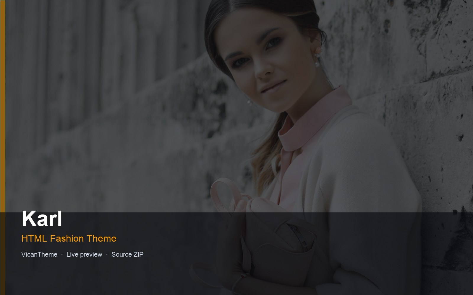
Pairing expressive serif display typefaces with crisp, highly legible geometric sans-serif body fonts is the hallmark of modern editorial prestige. The Karl luxury fashion theme exemplifies this mastery, combining editorial serif headlines with ultra-clean modern navigation to create the immersive feel of an international art publication.
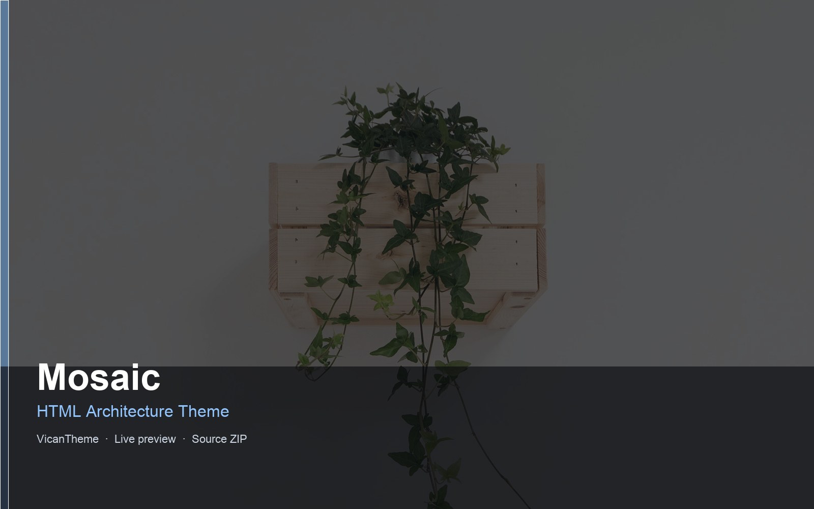
For architectural practices looking to balance structured typography with monumental photography, examine the layout principles of the Mosaic architecture template. You can also explore how high-craft brands establish digital stature in our essay on fashion atelier brand website identity.
Technical Typography: Font Performance and Contrast Compliance
Beautiful typography must never come at the expense of page speed or accessibility. Self-host your web fonts in modern WOFF2 format with font-display: swap to prevent Flash of Invisible Text (FOIT). Ensure your body text strictly exceeds WCAG 4.5:1 contrast standards, as detailed in our accessibility checklist for web templates.
Explore our complete web design gallery to discover templates designed with world-class typographic craftsmanship.