The Reality of the 70% Mobile Commerce Era
Across the United States, the UK, and Canada, over 65% to 75% of initial commercial website visits now originate on smartphones. Whether a customer is researching an emergency home service contractor from their driveway, browsing luxury apparel on the subway, or reviewing SaaS pricing during a morning commute, the mobile experience is the true frontline of your business.
Yet countless businesses still design their websites on ultra-wide desktop monitors, treating mobile responsiveness as a secondary shrinking exercise. When desktop menus are arbitrarily compressed into awkward hamburger drawers and text requires pinching and zooming, mobile conversions plummet by up to 60%.
Core Architectural Rules of Mobile-First Conversion Design
To capture and retain high-intent mobile searchers, modern digital interfaces must adhere to thumb-driven ergonomics and immediate visual feedback:
- The Thumb-Zone Navigation Principle: Keep primary action buttons—such as "Book Appointment," "Call Now," or "Add to Cart"—within the natural sweep of the user's thumb in the lower third of the mobile screen.
- Streamlined Single-Column Hierarchy: Eliminate multi-column clutter. Stack value propositions sequentially: hook headline, visual proof, key benefits, and a frictionless primary CTA.
- Autofill-Optimized Mobile Form Fields: Configure HTML inputs with proper input types (tel, email, number) and autocomplete tags, allowing iOS and Android devices to populate checkout fields with a single biometric tap.
- Zero Cumulative Layout Shift (CLS): Reserve exact aspect-ratio containers for images and embedded videos, preventing content from jumping as the mobile page streams over cellular data.
The Performance Advantage of Lightweight HTML Frameworks
Mobile networks—even 5G connections—exhibit unpredictable latency and packet loss. Websites burdened with megabytes of JavaScript libraries often freeze on mobile browsers, causing immediate tab abandonment.
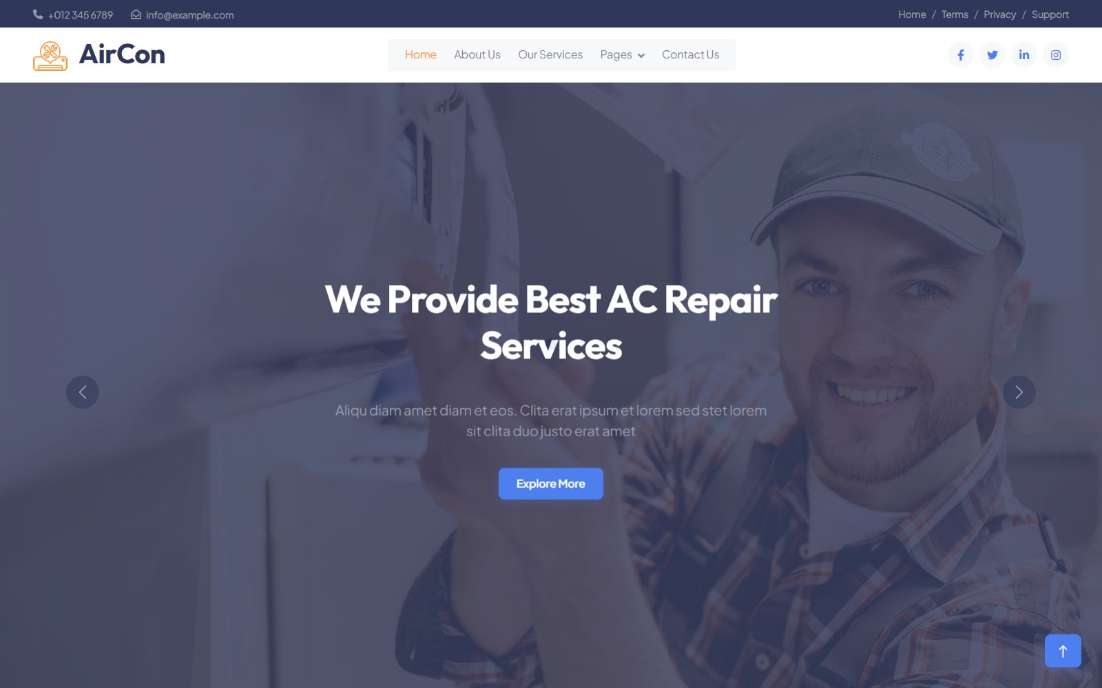
Clean HTML and CSS templates deliver deterministic, instantaneous rendering on any smartphone. The Zinc small business template is engineered specifically around mobile-first utility, offering fluid typography scaling, lightweight mobile drawers, and rapid tap responsiveness. For trade services where mobile urgency is paramount, explore our breakdown of the Aircon contractor theme designed for instant emergency mobile dispatch.
Continuous Mobile Auditing and Testing
Do not rely solely on Chrome DevTools mobile emulation. Test your live website on real physical devices across varying screen sizes and cellular connection speeds. Consult our essential guide on accessibility and mobile usability checklists to guarantee smooth interaction for all users. Explore our comprehensive web design collection to deploy mobile-optimized digital storefronts that convert effortlessly.